7th Circuit has no patience for Bernhard Modern—a typeface, not a person

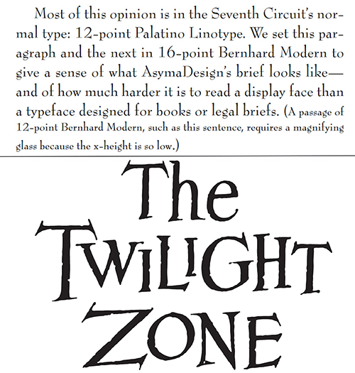
Chicago Lawyer Jason R. Epstein’s “brief is set in Bernhard Modern, a display face suited to movie posters and used in the title sequence of The Twilight Zone TV show,” wrote Judge Frank Easterbrook of the 7th U.S. Circuit Court of Appeals at Chicago. (Images from the 7th Circuit’s June 3 decision and by YourGloriousLeader, PD textlogo, via Wikimedia Commons)
The 7th U.S. Circuit Court of Appeals at Chicago is no fan of Bernhard Modern, a typeface used by a Chicago lawyer to the dismay of an appellate panel.
“We hope that Bernhard Modern has made its last appearance in an appellate brief,” the appeals court sniffed in a June 3 decision by Judge Frank Easterbrook.
The 7th Circuit urged all lawyers to read and follow the advice in the circuit’s Practitioner’s Handbook for Appeals, which advises lawyers to use typefaces suitable for books and to choose the most legible typeface available to them.
The appeals court recommended “proportionally spaced serif faces,” in which the width of character dictates the amount of horizontal space that it receives. The appeals court also favors type with a larger “x-height,” defined by the court as type “in which the letter x is taller in relation to a capital letter.”
“Any face with the word ‘book’ in its name is likely to be good for legal work,” the 7th Circuit said, citing examples such as Century Schoolbook and Bookman Old Style. About 20 suitable typefaces are listed.
Lawyer Jason R. Epstein, who represented the losing appellant, “did not heed this advice,” Easterbrook wrote. “His brief is set in Bernhard Modern, a display face suited to movie posters and used in the title sequence of The Twilight Zone TV show.”
To illustrate, the court published two paragraphs of its opinion in Bernhard Modern.
Easterbrook is an “astute aficionado of typography” who was chief author of a rule revising requirements for appellate briefs in the Federal Rules of Appellate Procedure, according to a January 2014 ABA Journal column by Black’s Law Dictionary editor-in-chief Bryan Garner, who’s also a Journal contributor.
Even then, Easterbrook favored proportional serif fonts. But the revised rule allowed for a monospaced font such as Courier following “a firestorm of correspondence” by those who didn’t want to give up the typeface.
Epstein told Reuters that he has practiced law for more than 25 years without once receiving a complaint about his beloved Bernhard Modern font. If he decides to ask the 7th Circuit to reconsider its adverse ruling for his client, he will be obliged to use the most legible typeface, as recommended by the court.
“If Bernhard Mod is still the easiest to read, I would be compelled to use it,” Epstein told Reuters.
Write a letter to the editor, share a story tip or update, or report an error.


