How architecture affects communication during meetings

Shutterstock
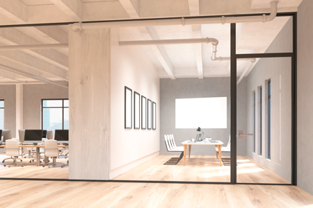
This month, Bryan Garner on Words takes up an unusual subject: how architecture promotes or hampers communication. Every organization has face-to-face meetings, and where you hold them can influence their success or failure. Here are some pointers on arranging a meeting space that maximizes participants’ attention and comfort. They are based on my experience teaching more than 3,000 CLE programs in a great variety of settings—everything from conference rooms to football stadiums to rented bars.
Design decisions subliminally influence people’s experience at work—even their job satisfaction. The relative success or failure of meetings, whether with clients, colleagues or outside speakers, depends in part on how the space makes people feel.
Let’s say your organization’s leadership has said that dedicated meeting space is crucial to the group’s mission. You’ve been tapped to build or modify the space. Here are a dozen points you might consider.
Design a room that’s squarish, not an elongated rectangle. A squarish room can be arranged so the speaker is close to more of the participants and can make good eye contact. A long, narrow room, by contrast, produces feelings of distance and alienation from the speaker. Although it’s possible to have successful meetings in such a room, some participants will inevitably feel isolated. The longer the meeting, the more intense those feelings will be.
Remember: Never design a room based on furniture, such as a typical board table. The furniture should match the function, not vice versa.
If you’re forced to ignore that advice and have a rectangular room, don’t custom-make a massive conference table inside. Whether it’s a firmwide meeting or a CLE presentation, you’ll want to be versatile in setting a room. A long, wide table—even if it bows out in the middle—doesn’t let everyone see the speaker.
I’ve taught in rooms with a single table seating 30 on each side and three at each end. If the presentation is less than an hour and the presenter is skillful, people can be quite happy in that environment. But longer presentations can have everyone struggling to maintain attention and energy.
Invest in smaller, two- to three-person tables. For presentations requiring a writing surface, you’ll want tables that aren’t too deep. (The deeper they are, the more distance created between the speaker and each successive row of participants.) You might think about handsome but easily movable tables that don’t require tablecloths. If you acquire 8-foot-by-2-foot tables, three people can sit at them; if 6-by-2, then two. Elbow room means just as much here as on a plane: Would you prefer economy or first class?
Then learn how to arrange the tables creatively: sometimes classroom-style, sometimes in a large U, sometimes in a complete square with the speaker in the middle.
Avoid pillars that break up the space. If the space you’re planning is interrupted by visual blockers, you’ll spend your entire tenancy planning around them. The room’s versatility will be severely hampered, forcing speakers to remain absolutely immobile or else risk becoming invisible to some participants. For profes-sional speakers, both options are undesirable. And if the meeting is to be highly participatory, columns quickly become obstacles to communication.
Ensure that doors open and close silently. This is an absolute imperative. Make sure that the doors are utterly silent. Avoid a mechanism that causes the door to shut itself noisily: Hardware has evolved to combat this problem, so use it. Nor should you hear a click every time the latch engages. You must tell the space planners that doors are to be completely silent, while remaining lockable and secure.
We’re trying to solve two problems here. The first is the flaw of loud doors designed by people who don’t know or care much about successful meetings; the second is passive-aggressive participants who come and go with maximal clatter.
When I first started teaching CLE full time, I read up on how to give successful seminars. To my surprise, several books went into some detail on how to silence noisy doors. They recommended carrying your own WD-40 for hinges, taping latches so they remain permanently recessed during meetings, and taping napkins to the tops of doors to prevent slamming. I’ve done all three over the years.
Unduly concerned, you say? Not at all. The world’s best speaker can’t thrive in a room with intermittent bangs.
Install flooring that allows people to come and go silently. This means carpet. Don’t put hard flooring into a large conference room. As soon as you do, people will start wearing tap shoes.
Plan to use a nearby room for serving food, preferably not the meeting room itself. Many firms think they’re smart by putting their biggest conference room next to a break room or kitchen. Sometimes a screen will rise to reveal a smorgasbord at breaks. How clever. Here’s the problem: The food preparers are typically noisy, even shouting instructions at one another; and the screens provide no sound barrier. Even a sign reading “Quiet, please: Meeting in progress” will have no real effect. Envision your managing partner having a talk interrupted by stridulous voices from the kitchen.
If the food is consumed in the meeting room, you’re left with either the distraction of clearing plates—possibly while the meeting resumes—or the lingering odor of leftovers disposed of in the room itself.
So if you can, plan to have a system in which you can say: “Lunch will be served in conference room C down the hall.”
Install a functional and versatile sound system that runs microphones separately from computer sound. So-called smart sound systems that try to connect everything are often just dumb. Call me a Luddite, but knobs are good. Touch screens requiring logins to adjust sound are bad, especially when raising the volume for computer sound simultaneously raises the mic volume. Requiring IT assistance for every adjustment disrupts the presentation and squanders everyone’s time and energy. Make your sound system easy—and, most of all, versatile.
If you’re installing a projector, do it sensibly. First, let’s note that many people are using LED screens these days, and they’re putting several of them around conference rooms. They’re excellent, and I’m a fan.
But there’s nothing wrong with a projector. Get the highest lumens possible. If mounting it on the ceiling, place it to have the shortest possible “throw.” Ideally, the speaker can stand almost right underneath the device while it projects directly behind the speaker. If it’s too far from the screen, the projector shines in the speaker’s eyes and the speaker has to stand in the corner to keep from being blinded and from casting a shadow on the screen.
Give ample thought to lighting. Natural light is best, of course—preferably entering each room from two directions. But that’s not always possible for every room. Fine. Think about lighting sources. LED lights won’t give off heat, and they come in warm and cool tones. Consider hiring a lighting consultant. Ask for maximal illumination with dimmability. Avoid inadvertent dark spots. Remember that the brightest lights won’t wash out a projector with sufficient lumens.
Make sure the HVAC is well-equipped to handle the space, and if possible the room should have its own thermostat. It doesn’t make everyone happy, but a meeting room should remain on the cool side. If you adjust the room to make the coolest-blooded comfortable, it will be too warm for most participants—and that’s death to a meeting. Books on meetings advise to have 15 percent of the participants too cold: that way, 80 percent will be comfortable and only 5 percent too warm. With a little experience, cool-blooded folks know to wear layers.
The point, though, is that ideally the experienced speaker or organizers should be able to make instant adjustments to room temperature. If you’re dependent on a central engineering staff who might not respond to your request for an hour, your meetings will suffer.
Buy a couple of four-legged wooden stools. What’s the one prop a good speaker needs? A simple four-legged wooden stool, about 30 inches tall without a back. It’s unobtrusive and lets the speaker sit occasionally while still being high up enough to be seen by the seventh row. Adding a music stand for notes creates a clean, uncluttered stage. A simple stool can actually improve mediocre speakers by helping them engage more with the group.
What has this column had to do with words?
Everything. For the spoken word to be effective, the setting must be right.
This article appeared in the August 2017 issue of the ABA Journal with the headline “Space Matters: How architecture affects communication during meetings" Bryan A. Garner, the president of LawProse Inc., is among the most experienced CLE presenters in the United States. The author of more than 20 books and editor-in-chief of Black’s Law Dictionary, he has teaching appointments at the law schools of the University of Texas, Southern Methodist University and Texas A&M. Follow on Twitter @BryanAGarner.


